Prilo
branding
Challenge
Prilo is a unique solution on the market to manage the transport of cars. The platform connects carriers with companies that are looking for a partner to transport their cars.
Our task was to create a brand for the new platform.

About this
project


We organized a series of workshops with our client. During the first one, we explained the key elements of the brand, which helped later the work on the strategy. The next step was to select brand archetypes, create prototypes of key visuals, or define ways of communication. In the next stage, we worked on the brand name – we organized brainstorming sessions with the client and another one only with the team. The workshop was also supplemented with inspiration sessions. In the end, moodboards for the brand were created.


How did it go?
During the whole process we defined:
- brand archetype – ruler and explorer – this decision directly influenced the brand claim
- key brand characteristics
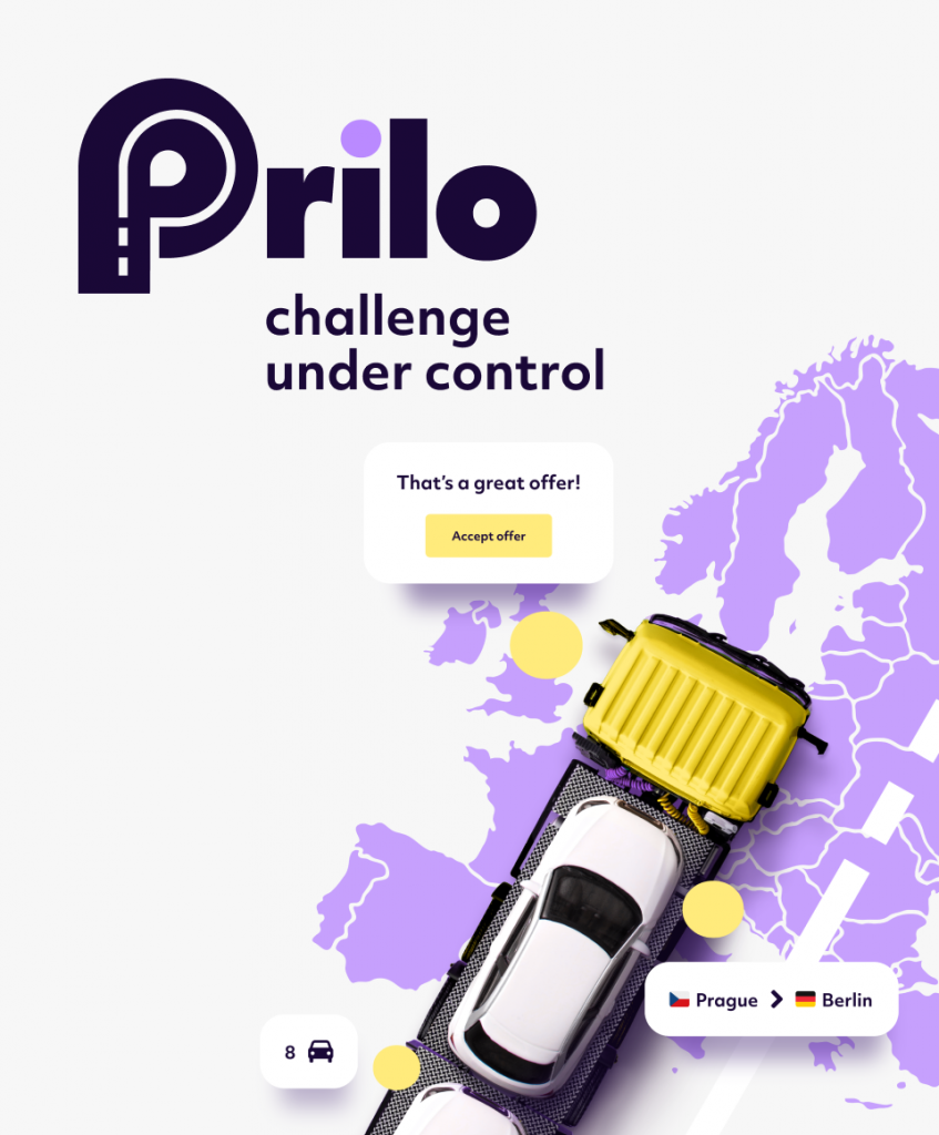
- brand name – Prilo – whose name refers to the claim your load is our priority
- claim: Challenge under control!
- a brand logo that refers to the brand – the letter P, which refers to the Prilo name, composed of a tire and a road
- the colors of the brand – are different from the competition – we opted for purple with yellow
- visual brand differentiators – a yellow truck, a line symbolizing the road, and a purple dot with the logo
- channels and formats of communication.
We also created video explainers and animations for the website that simply show how the platform works.


