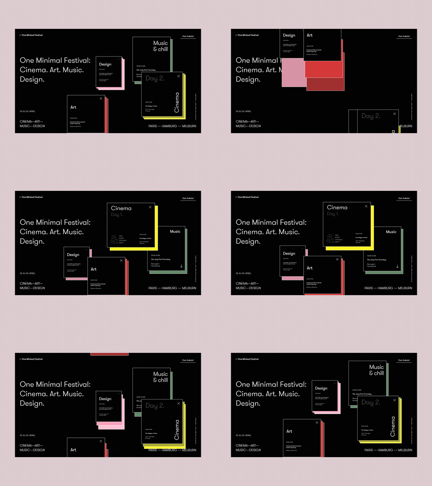
Well-designed websites are a visual statement that we care about our users and want their experience with our site to be pleasant and intuitive. Such websites or applications are more likely to be remembered and appreciated by their visitors or professional communities.
- Micro animations improve the navigation of a website or application.
- They make it easier for users to interact with the page.
- Provide users with immediate and relevant feedback on the action performed.
- They give clues to users, allowing them to explore content easier.
- Attract attention focusing on the most important actions – e.g. show whether a given element is active.
- They evoke positive emotions in the user and give satisfaction while “playing” with them.
In short – motion and emotion <3 That’s why we love them and share with you some of the many examples worth attention. Enjoy!
Let’s go rally has prepared a great example of an engaging scrolling animation combined with a color code assigned to a particular section. Thanks to this treatment minimalistic design of the site comes to life and the user is easily guided through the content.
This example shows how we can use code to make illustrations on our website dynamic and interesting. Adding movement focuses the user’s attention on the elements that are important to us and enriches the graphics that are consistent with our brand.


The following examples show how a micro animation can add variety to our website when scrolling. Loading new content in an attractive way encourages to get to know them better and is the “wow effect” which, without being fully aware of it, we so willingly look for on browsed pages. As you can see there are many possibilities and we are limited only by our imagination.
Pricing – can be a template section showing the differences between the available options, or a crazy experience, a journey influenced by our choice. Cuberto in this case has done it with flair, which will definitely be remembered positively by the user, who will form a very positive relationship with this section.
Another example from Cuberto bringing a smile to the user’s face. “Sticky blobs” encourage users to dig through the application’s functionalities. Thanks to that, the whole thing seems to be as friendly as possible, and it is fun to simply play with it. You can show it to a friend, share and accidentally create a viral. Fame is guaranteed.
And another one. Because this effect really is pleasing to the eye.^^
This example shows how engaging an application with minimalistic design can be. Micro animations focus the user’s attention on important elements of the interface, compensating for its minimalistic style.

