


Choosing the right font is always a challenge, let alone matching two fonts so that they work together without rivalry. Their correct selection determines the perception of our design and affects the readability.
Designers can instinctively select matching types, but even they have their favourite proven combinations, to which they like to return from time to time.
What to look out for when putting fonts together?
- Matching fonts from the same font superfamilies, unless they don’t look too similar
- Pairing of contrasting typefaces
- Less is more, i.e. max. 3 typefaces, of which only one is distinct
- Fonts with the same “x” height
Typography is one of the most important components of design, it conveys content, it conveys information to our audience.
That’s why it’s so important to consider at the very beginning of designing what typeface is appropriate for the character of the project, which sizes to use and which combinations are best. Without further ado, we would like to share with you some examples of tried and tested classics and combinations we find interesting.
Bodoni and Brandon Grotesque
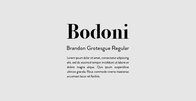
Bodoni is a font designed by Giambattista Bodoni around 1780 and is a serif typeface designed as a printing script. It is a big font family with numerous weights and styles. This font is perfect for headlines and displays. We think it pairs well with Brandon Grotesque, a great sans-serif typeface designed by German designer Hannes von Döhren in 2010. Why does it complements Bodoni so well? These types are chosen in contrast: one is dominant and expressive, the other one has a functional look with a warm touch.
Sofia Pro and Futura
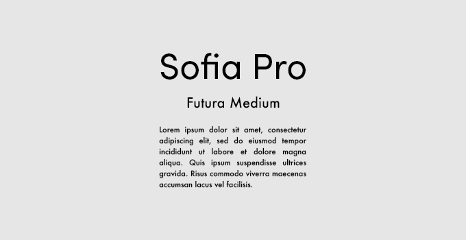
A somewhat controversial combination. Both fonts are sans serif and similar at first glance, but they complement each other very well. Headline font is Sofia Pro designed by Olivier Gourvat who started in 2009 and completely redesigned in 2012. It comes with 40 styles and provides a total of eight weights. It’s so popular among designers because of it’s rounded curves along with open terminals. It is balanced by Futura, because of its structural and geometric presence.
Yeseva One and Josefin Sans

Headline font: Yeseva One seems a little feminine. “Yeseva’s name is from the phrase “Yes, Eva.”As a sign of complete agreement between a man and a woman.” says about this font its designer Jovanny Lemonad. Paired with Josefin Sans it gives a retro and classy vibe.
Pacifico and Quicksand
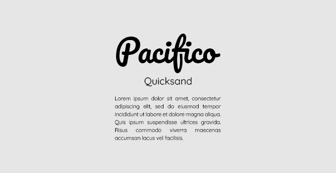
Pacifico’s brush textual style that’s ideal for use in headings, and Quicksand is a display sans serif with rounded terminals. This pair is a good set when you want to give your projects a summer and tropical vibe. They both are round and playful in nature, so they are perfect for projects in the holiday theme.
Condor Comp and Hero New
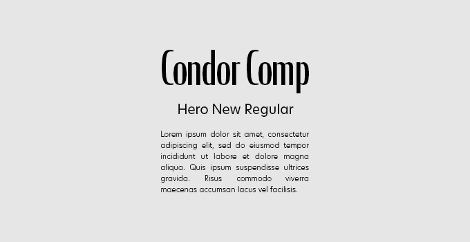
Condor designed by David Jonathan Ross is a high-contrast sans serif typeface, which is characterised by a contrast in thickness and thickness. A geometric san Hero New designed by Miles Newlyn, compliments Condor with its timeless simplicity.
Cooper and Cooper
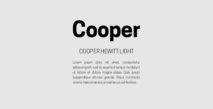
That pair represents the pairing within the font superfamily. Superfamilies tend to incorporate a pairing of at least a serif and sans serif. With a variety of options in one family we can make proper contrast without using typo from another family.
Cinzel and Fauna One

Cinzel, a decorative sans-serif typeface designed by Natanael Gama, is a font inspired by first century roman inscriptions. It sits really well with Fauna One with low contrast strokes and soft terminals, it’s structure is soft and slightly condensed. Despite many commonalities, the two serif fonts work well together for this very reason. You can see which is stronger and which complements it, but they harmonise with each other giving a really sophisticated vibe.
The possibilities of choosing fonts are really huge, so to make the process easier for yourself, you should apply some of the tips we gave at the beginning. Do not ignore this stage – after all, a font is something more than just a nice sign. 🙂
