During the first moments of browsing a website, we make a general assessment of the situation: where the menu is, how we can obtain information we are looking for, what the website is about. If everything creates a consistent whole, the chance that the user will stay on the website for longer increases. In order to make it happen, order all the elements according to the principle “Don’t force me to think”, which has a positive influence on human brain. What will help us to order the website elements correctly? Stick to the rules of Gestalt psychology. This school of psychology relates to perception. Its main goal is showing how our mind perceives the relationship between the whole and the parts that make up the whole.
Similarity principle
We categorise objects that look similar into one group, while those that look different remain outside the group.
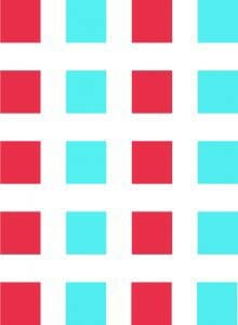
How does it look in practice? The Zalando website uses two types of fonts and, although the menu items are close to one another, we can easily discern which items belong to which menu.

A similar solution can be noticed at letsfreckle.com, where we do not even have to put any effort to see which information relates to which offer.

Continuity principle
If elements create a continuous line, we perceive them as related to each other, even if they differ in colour. The continuity principle allows us to direct the user’s attention. We can draw their attention to the fact that only three steps are necessary to eat a delicious dinner.

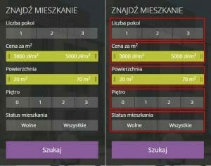
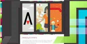
Proximity principle
We automatically group together elements that are closer to one another. The proximity principle makes our mind perceive objects as a whole group. For example, a user that ends up at the Brzozowy Gaj website can narrow down their search to a specific area. They do not have to wonder which field is associated with which heading. This is what we are talking about. The user should not think hard and hesitate because the longer they do this, the more likely it is that they will leave the website.
Closure principle
See the figure below. What do you see? Is it a triangle on the background of three circles? This is how our brain works. Driven by the closure principle we see shapes that are actually not present.
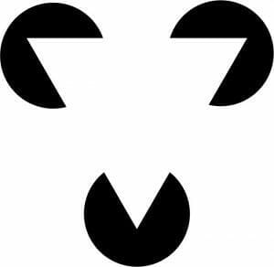
We can play with our mind like that when, for example, designing a logo.

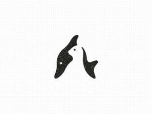
Despite the fact that some parts of the letters are covered, we still are able to read the text. Our brains are able to fill in the lacking elements so that we still can understand the message.

Figure-ground principle
Our eye tends to separate objects from the background. A classic example of this principle is the vase – one time we see the picture as a vase, the other time we see two face profiles. Interestingly, we are not able to see the vase and the faces at the same time.

The figure-ground principle can also be employed to logo design, like in the example below.
The duoh.com website contains a range of graphics and text that seem to intertwine with the drawings and the background. What is more, using the mouse pointer, we can stimulate the change between the figure and the background.
The Gestalt principles will help to improve interface design and understand when something is necessary and when not. We can assess where to put an element on the website or how to group a larger number of objects, or what colour and size of an element to choose. This way, we help the user find faster what they are looking for at our website. And remember, when doing that, follow these two principles:
- do not force the user to think too much – intuitiveness above all else;
- pursuing minimalism is a key to success.